Edited by my beloved friend K.L
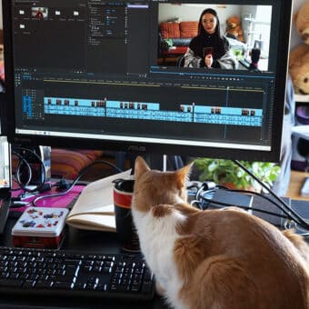
This article is accompanied by a video (in French with English subtitles):
The last time I shared with you a behind-the-scenes of a true client project; it was about a year ago.Since then, for the past year, I was able to let you know about my work process only through my personal projects and a “fake” client project.
Today, I’m going to take you behind the scenes of a real client project, including instructions, requests for modifications, and even, some real screw-ups (yes, it happens).
You will see that no detail of this illustration were random, you will also get to discover one interesting story lacing the past and the future in one single illustration, and you will see the magical life of an illustration, beyond a commission.
A special project, a special subject and an “extra” special client
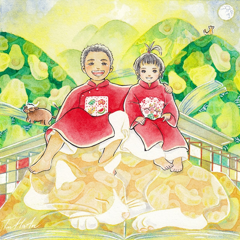
« Duyên »
My dear readers, to start off, I want to tell you the story of a girl, named Hương, born and raised Vietnamese. At the age of 11, she happened to share a bag of snack (sneakily) during nap time with one classmate, who would later become one of her friends.
In Vietnamese, we have this word “duyên”, meaning a predestined tie that some people are believed to have to meet each other.
By that time, Hương did not know that the moment the first potato chip was devoured, she forged the “duyên” with the most chaotic person in her future friends circle.
Hương has always been pragmatic, intelligent, and much more mature than her age. Back then, she was quick to know how utopian her classmate’s dream was, and always has been. But strangely enough, she supported it.
Hương continued to be by her friend’s side, despite the differences in their life philosophy, despite the 7846 km that separated the two girls after Hương moved away, despite the many foolish, unconscious and improbable decisions that her friend made.
Then, almost 20 years later, with her unconditional support, this friend of Hương made her dream come true: she become an illustrator.
The beginning of the trilogy
You probably guessed it: It was me, that chaotic friend of Hương.
The biggest chaos Hương had to endure for a long time was my inability to turn down requests for free artwork. This led, for me, to hours of phone conversations filled with introversion and questioning.
During our 20-years friendship, due to my lack of time, and because Hương was horrified at the idea of making me work for free, she only got two drawings from me.
Yet those are two illustrations that marked two milestones in my creative life:
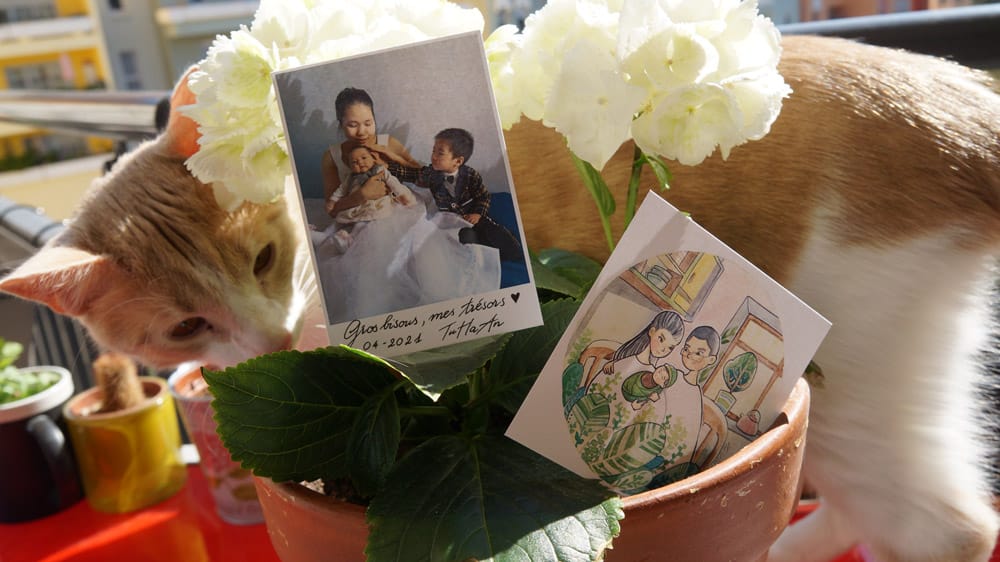
- In 2019, the drawing that announced the birth of her first child, nickname “Bơ,” was the one that confirmed my love for watercolor. Since that day, watercolor became my main tool for creation.
- In 2021, the announcement for the arrival of her second child, nickname “Susu”, confirmed the drawing style that I keep until this day.
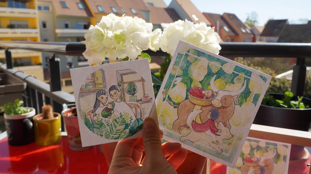
This year, in 2023, for her 30th birthday, Hương decided to gift herself with one more illustration of her two children. On top of that, she wanted a piece that could form a trilogy with those that were made in 2019 and 2021. Making a trilogy is also believed to bring even more luck to the giver than the receiver.
The brief – challenge accepted !
Hương was specific about what she wanted, but still left plenty of room for my creative freedom. Her requests were as following:
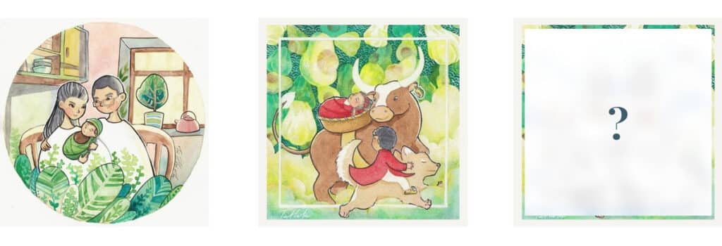
- Main idea: corlor full-page illustration featuring Bơ and Susu, photo reference
- Technique: traditional, watercolor on paper
- Size: 14cm x 14cm
- Atmosphere: fantasy, dreamy
- Must-included details:
- children in sitting position, clothes as in the photo reference (áo dài)
- attention to patterns on the áo dài
- children are barefoot (as usual)
In short, this is a dreamlike kind of illustration commission, with cultural elements. And this is exactly the kind of project that drives me the most.
Step 1/3: Research and rough sketch – EASY level
The first step of the design was a breeze. I created the sketch on a digital tablet to make it easier to make changes.
The main characters
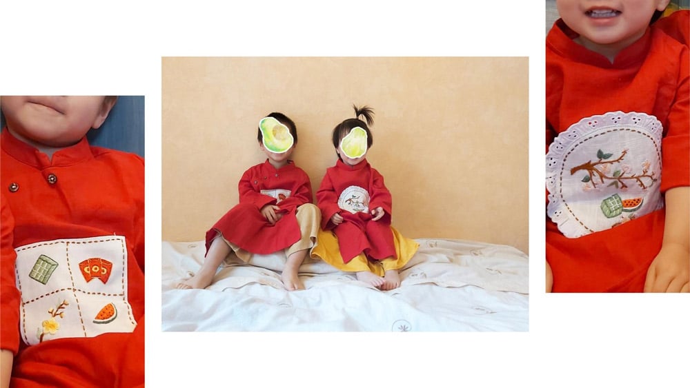
I replicated almost identically the posture of the two children in the photo except one detail. With one small arrangement, I put Bơ’s left hand on his sister’s shoulder, creating thereby more connection between the two of them and showing more of the embroidered pattern on his outfit.
The secondary characters
Bơ and Susu are drawn sitting on the back of a magic cat, because 2023 is the year of the cat in the Vietnamese lunar calendar. In addition, cat is Bơ’s favorite animal as well!
The buffalo and the dog respectively are the birth years of these siblings in Vietnamese zodiac sign. Besides, these two animals are already present on the illustration that announced Susu’s birth. The position of the animals in the illustration, with the dog farthest away and the cat , also gives idea of the time passing by.
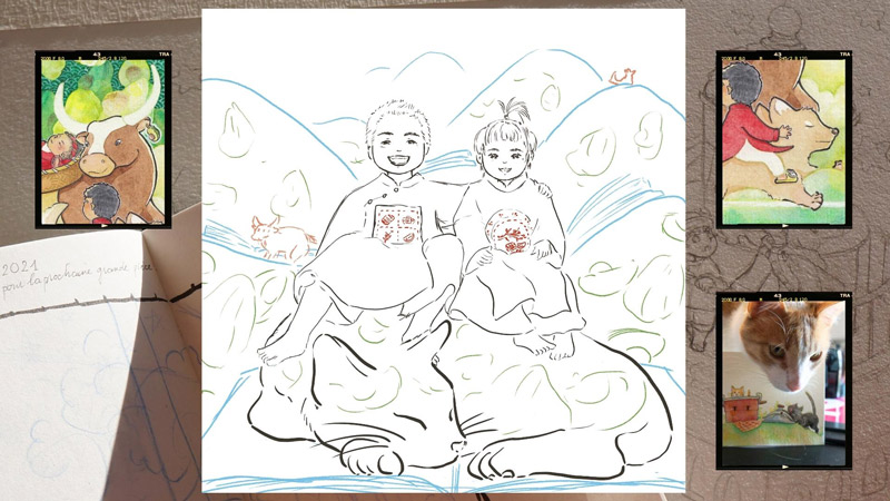
Landscapes and details
The landscape is a reminiscence of the nature of Vietnam, the home country of these two child, that Hương is very much keen to show them in the near future. It also represents the uneven side of Lyon, their now hometown.
The details on the back of the cat and on the hills are nods to the children’s nicknames. Indeed, Bơ means “avocado” in Vietnamese, and Susu means “chayote”
The image of the open books emphasizes the fantastic world of the illustration, as in the stories that Bơ and Susu begin to discover. One could think of these pages as pages of knowledge that open them to the future, or pages of diaries that eternally keep their memories intact.
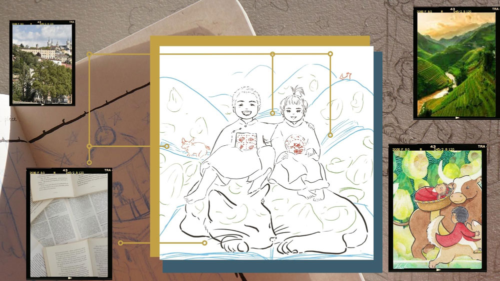
Modifications of the rough sketch
Upon receiving the first sketch, Hương wanted to make two changes:
- Remove some ” chubbiness ” from the children’s faces, because in reality, Bơ and Susu are more on the slim side;
- “Photoshop” Bơ’s eyes, because a few days before the reference photo was taken, Bơ had a scooter accident that made his eyelids swell alittle bit.
On the other hand, Hương also immediately noticed that this illustration contained all the five elements of Phong Thuy (feng shui in Vietnamese):
- Wood (the element of Bơ’s birth year),
- Earth (the element of Susu’s birth year),
- Fire (the color of áo dài),
- Metal (the color of the cat),
- Water (the rivers formed by the books’ pages).
(Notes to artists: get yourself a friend gifted in literary analysis at school, she or he will be your best ally in detecting the hidden meaning in your own works 😁)
Hương also told me that the river reminded her of the siblings’ birthplace, which is a hospital on the Rhône quay. This information gave me the idea to add the hospital building to the drawing to have a concrete element of Lyon.
Here is the sketch after modifications:
Step 2/3: Final sketch and color palette – MEDIUM level
Transferring the sketch
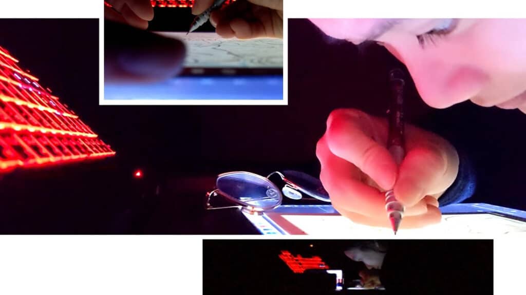
Once the rough sketch is validated, I made a clean sketch on paper.
I don’t have a light table yet, so the picture below is my wobbly replacement system (actually, it was the laptop laid upside down and the screen was used as a light table… This is mainly why this level is not EASY).
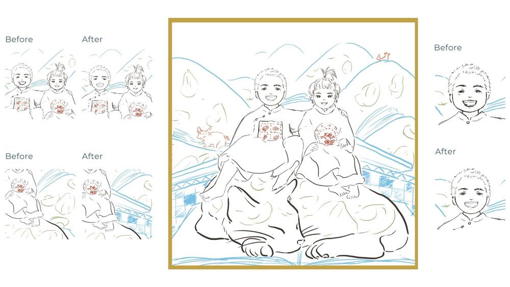
Modifications of the final sketch
The only change Hương wanted for this sketch was to add the moon above the dog. She thought of an illustration that I did for Inktober 2019 and said she would love to see Bơ’s puppy with a moon as well.
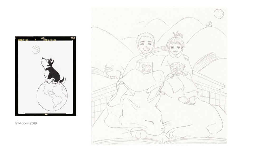
Keep going, Hương wanted the puppy to turn to the right, toward the moon, because East is on the right side of the compasses. But… why the East? Because Vietnam is in the East. And in the first name of the two children, there is the word “Nguyên”, which means the origins. Such was Hương’s dearly wish that her children will always remember their origins.
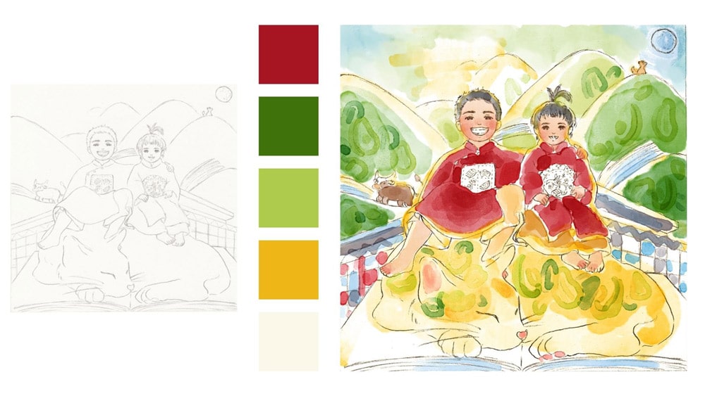
The color palette
The choice of colors for this illustration is rather simple, because I just have to base on the first two illustrations of the trilogy. Green is picked for the background.
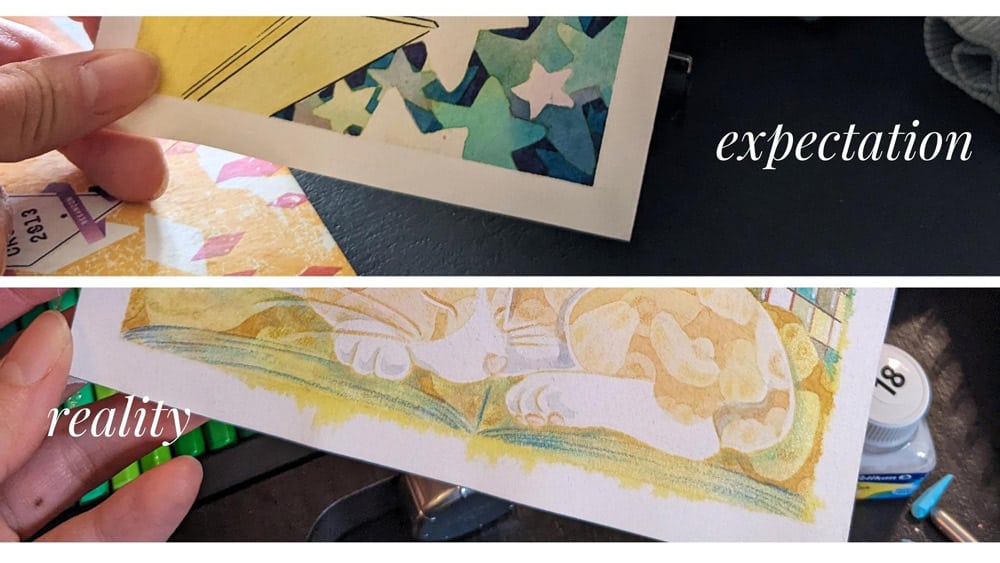
Everything was sailing smooth until my favorite part: coloring. This is where I screwed up…
Step 3/3: Coloring: challenge and patience – DIFFICULT EXTREME DIFFICULT level
The monumental screw-up
(My client will discover my screw-up by reading this article, at the same time as you… 😅)
Thing is I wanted to reproduce a secret technique used for the 2021 illustration: using dishwashing liquid.
Yes, I use dishwashing liquid to create special effects with the color bubbles.
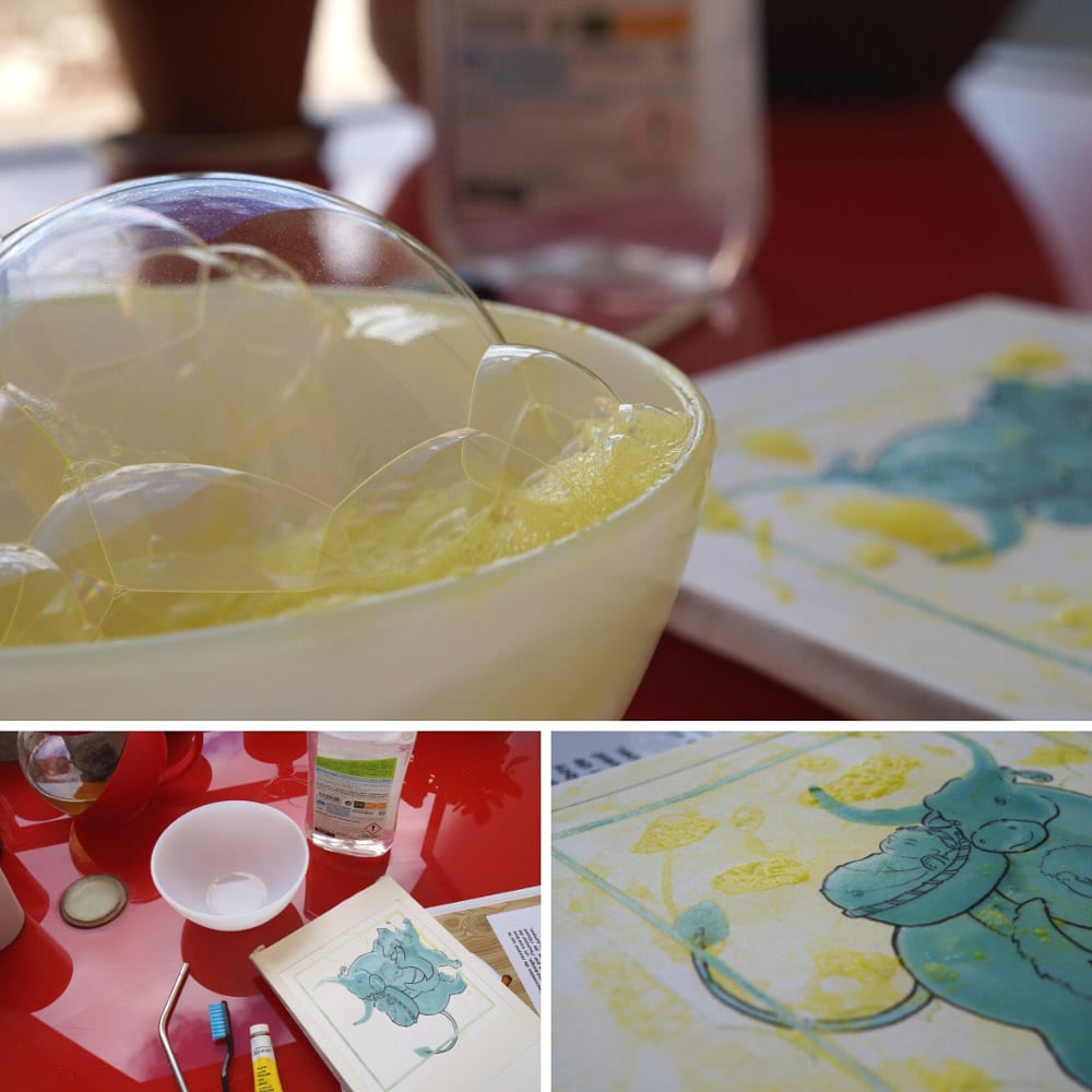
Two years ago, I mixed dishwashing liquid with gouache bought from Intermarché (a popular middle-range supermarket in France), and used it on watercolor paper bought from a mere depot store. This year, I have Sennelier ink (a Louis Vuitton equivalent of ink) and Arches paper (a Dior equivalent of paper). As I am familiar with this technique, I did not test this new combination before applying directly to my freshly inked sketch. I was sure that the effect would be 100 times more awesome than two years ago, given the majestic quality of the material.
Except that… the mixture of washing up liquid + Louis Vuitton inks + Dior papers didn’t give enough bubbles! Therefore, I repeated the process several times to fully achieve the effect that I wanted, until I suddenly realized that the excess ink gave a yellowish tint on the whole illustration.
I screwed up.
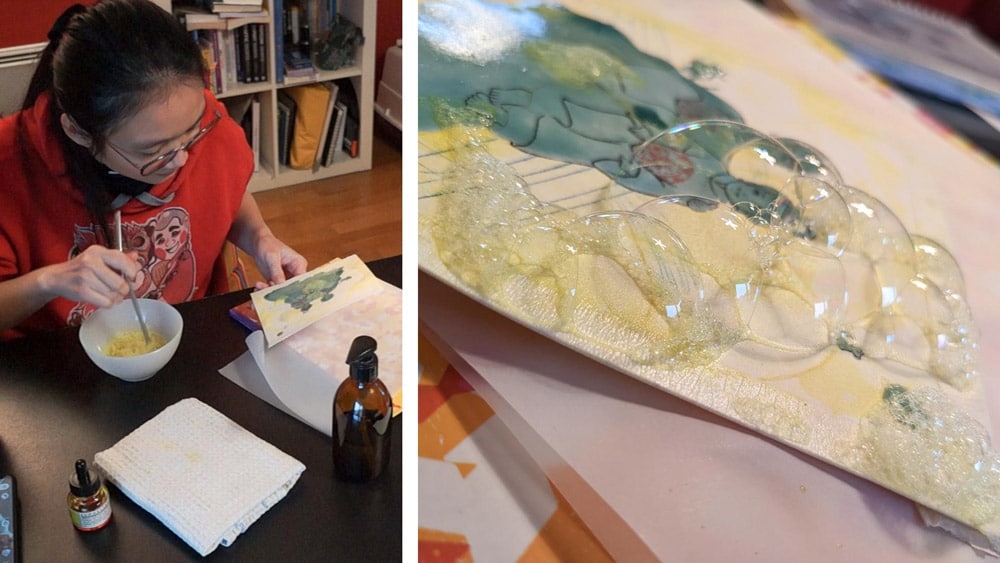
But troubles didn’t stop there. By applying the mix too many times, the liquid ink was sliding under the protective tape of the border. Instead of a clean white border, I ended up with a border full of yellowish smudges.
The decisive choice
In case of a glitch in traditional illustration, there are two solutions:
- Solution #1: Since I scan the illustration at each time that I am satisfied with one work step, I can simply print the last scan and start again from where I left off (i.e., before the mess).
- Solution #2: Continue with the screw-up as a challenge. If I still manage to get a satisfactory result, my technical level will be confirmed.
To choose between these two options, asking three questions is largely sufficient:
- Does the blunder prevent me from fulfilling the instructions defined in the brief?
- Would continuing with this screwed-up version make me anxiousus?
- Does the technique required to correct the mistake go beyond my current technique level?
Just one “yes” to any of the questions above would drive me to choose the safe solution: solution #1.
But since all three of my answers were actually “no”, I went for solution #2.
EXTREME level – EXTREME concentration – EXTREME fun
There isn’t really a lot to say about this step, other than hours and hours spent adding strokes and layers on the paper.
Coloring has often been the most satisfying step for me. And this time, even the most fun, because sometimes, when I ran the brush full of water over a spot where there was too much dishwashing liquid, mini bubbles would pop up as if I was “washing” the windows of the hospital, or the sky. 😂
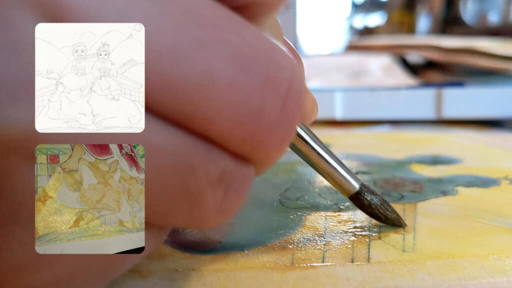
To correct the yellowish tint, I adjusted the tint of the chosen colors. White ink was also useful to camouflage some areas, and to globally lighten the illustration.
For the border, nothing was easier, I just made a new paper border and glued it on the illustration.
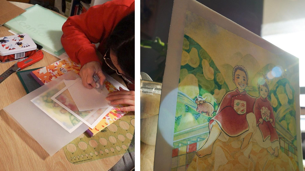
Bonus Step: Framing – BEGINNER Level (to meet an expert)
Two years ago, I sent the illustration for Susu’s birth announcement to Hương with a frame, the painting placed between two glasses.
Even this glass side has some memories in it. In 2021, because of COVID, hospital visits are prohibited. The day after Susu was born, Hương and her husband carried Susu to the glass side of her room so I could see her from the tramway station downstairs at the hospital.
At the time, I had cobbled together the frame on my balcony with a cheap frame, tape, and a transparent plastic sheet.
This year, to deliver a product that could be both beautiful and resistant, I called upon the expertise of a professional framer, Cadres Singuliers Dijon. The project ended with a fascinating session of discovery in the studio of a craftsman who is passionate about his work and the exchanges with his clients.
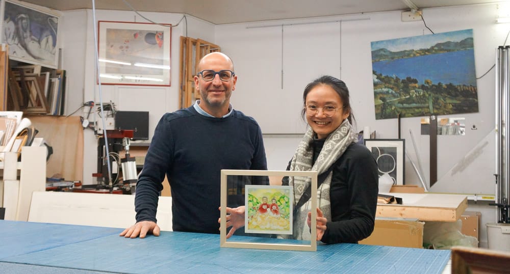
The life of an illustration
The third milestone of the trilogy
At the beginning of our collaboration, Hương suggested to makie the deposit to me on a specific date, the Thần Tài day (the God of Prosperity) in Vietnamese culture. Such was her intention to wish me good luck for the lunar new year.
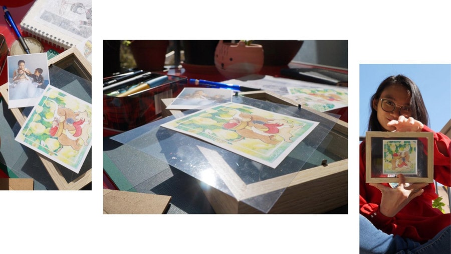
A few days later, I received the call for submissions for an exhibition at a tea house in Paris, with a theme of… cats.
The unique art print of Bơ and Susu’s illustration was then sent to this tea house to submit.
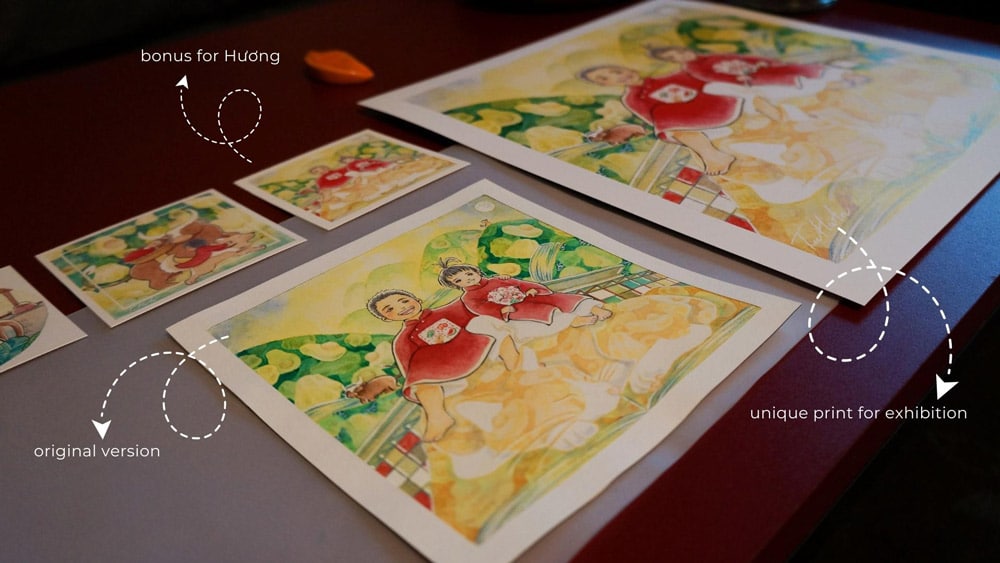
That was how I had my very first exhibition, the Mão de Trà Art exhibition, in Paris, from March 18 to May 22.
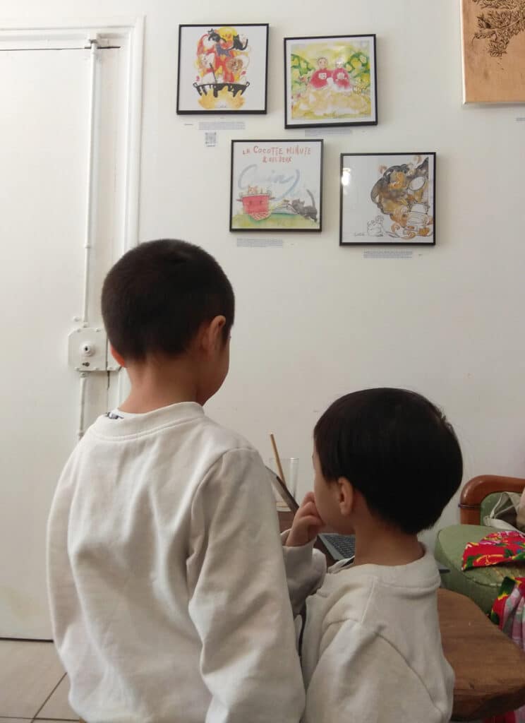
And the “duyên” continues
In April 2023, Bơ and Susu went to Trà Art where they had a photo with their drawing versions. Hương’s wish for luck seems to really work. Once again, the illustration for Hương marked a milestone in my creative life.
The original project, which was commissioned by love, created by love, and framed by love, is now reserved for the future office of Bơ and Susu’s dad.
As for Hương, I know she will read this article. And as usual, she will be the first one to alert me to any typos or misspellings. 😁
Me and Hương, we continue to weave our “duyên”, through snacks and bubble tea, through earnest words and unconditional support. I hope I could bring her as much of motivation, joy, and luck as she has brought me over all these years.
If you are curious about my detailed illustration process, here are two other very complete articles that trace my process from A to Z:
Keep creating!
Tu Ha An
*Please consult the information on Copyright & Intellectual Property before copying or mentioning the content and images of tuhaan.com
Related Posts
-

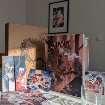
Book review : The Art of Kelogsloops – From Sketch to Finish
May 15, 2025 -
Behind the scenes of the Behind the Dream shooting, day by day
October 31, 2024 -
The mistakes that made me struggle on YouTube
May 5, 2024 -
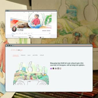
Behind the scenes of an illustration for professional client: Creative Adventure with D in Design
April 15, 2024 -
1 retrospective and 5 reasons that will save 5 years of your creative life
April 5, 2024