This article is accompanied by a video (in French with English subtitles), which will help you to follow step by step the operations.
If you are a creative person, the color palette is essential!
The color palette is even more important than the logo!
If you are a creator on the internet, such as a YouTuber, podcaster, blogger… or if you are an artisan, such as a ceramicist, musician, illustrator… then you are responsible for a personal brand.
If you want viewers to immediately recognize your brand when they see your post on their Instagram feed or your new video on the YouTube homepage, you need a strong visual identity.
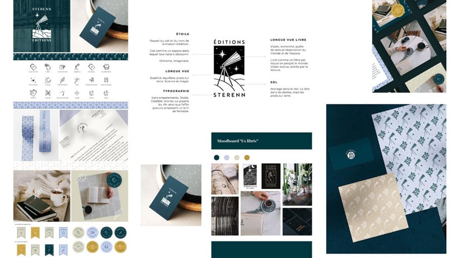
The ultimate solution to building a strong visual identity is to hire an Art Director (AD). This professional will help you define a whole graphic universe with a logo, a graphic charter, the colors, the typography, the graphic elements… Like the example of the extract of the Sterenn publishing house visual identity, realized by Lucile Escallier, one of the guests of the series Illustrator: the profession on the blog.
But if hiring an AD is not in your current priorities or budget, and you still want to highlight your uniqueness, differentiate yourself from others, and increase your credibility through your online content, do not waste time creating a logo. Define your color palette first!
While the logo is important to a brand’s identity, it cannot convey as much information as the color palette. The color palette is used across all of a brand’s communication materials, while the logo is just a stand-alone element.
The colors you use in each publication, each design, can have an impact on how your audience perceives your personal brand. Colors can help create a particular mood or evoke specific emotions in your audience so that people can remember you.
An example of the impact of color palettes
Here are 3 clothing brands, which work only on pre-order, and which focus on environmental protection, responsible consumption and sustainability of clothing.
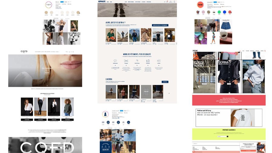
The very sober colors of CQFD accentuate the image of a luxurious, chic and serious brand. While the colors chosen by Asphalte underline the stable, simple and robust side of the brand. Patine‘s flashy colors represent its modern, lively and positive spirit.
3 common mistakes when choosing a color palette
While talking to my clients and prospects, I noticed 3 most common approaches among creative people and artisans:
- Imitate a creator you admire: Sure, the colors you use will ensure the emotions you want to evoke in your audience. But how can you become special and differentiate yourself from others if you copy exactly their visual identity?
- Choosing among the pretty palettes on Pinterest or Canva: Even if the proposed palettes are already harmonious and aesthetic, you risk getting lost with a hundred choices, without being sure that the chosen palette is consistent with the rest of your content.
- Choose according to “color psychology”: You want to choose black for its powerful and luxurious side. But how can you make sure your audience sees you as a premium brand and not a funeral service
3 steps to a quick and easy way to define your color palette
This method cannot replace the work of an AD
But until you are ready to hire a graphic designer, this method will help you keep the consistency of your visuals, increase your credibility while saving your time, so you can focus on your content and your core activity.
These colors must come from YOU, from your contents, from the essence of your brand.
Here is the 3-step principle:
- Choose 10 photos that you will use on your website, for your YouTube channel or on your publications on the networks, which best represent the mentality, the mood and the universe of your content. Then, make a collage.
- Extract a palette of 3 to 5 colors from this collage. These colors will certainly match the photos of your content. Congratulations: you’ve got your main palette.
- Generate a secondary palette using a lighter version of the colors in the main palette.
Step by step, and free tools to create your own color palette
To illustrate the deployment of this method, let’s take a concrete example.
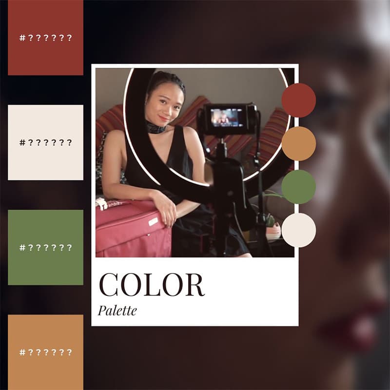
We’re going to create a color palette for a character from one of my old short films: Jeni Jelly, a lifestyle and beauty youtuber, specializing in vegan products.
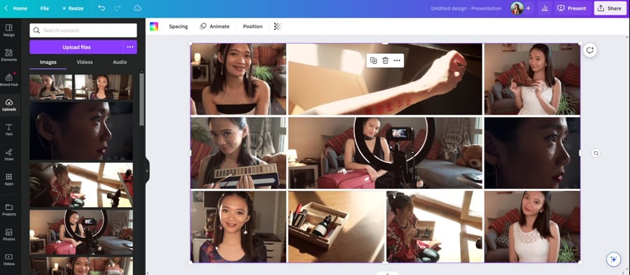
Step 1: Create the collage
Let’s use the Canva tool to create a collage of the 10 photos chosen beforehand:
Step 2: Extract a color palette
Tool 1: Canva Color Palette Generator
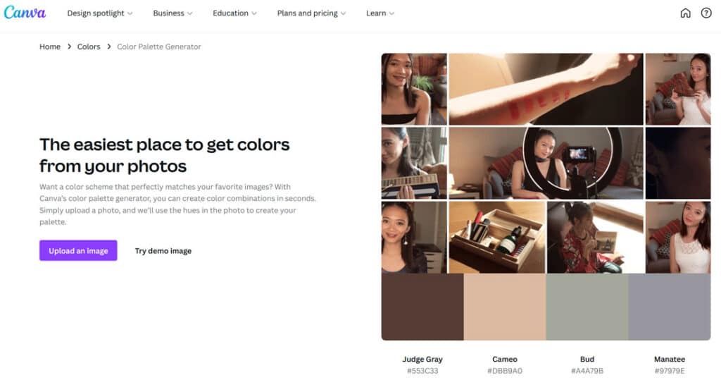
If you are satisfied with the result, congratulations! You’ve got your main palette.
In our example, the palette proposed by Canva Color Palette Generator is coherent and fits well with the environmental values carried by Jeni. But I find that these colors are too dull and too serious compared to the content that she proposes.
Since we can’t make changes to the palette proposed by Canva Color Palette Generator, let’s try another tool:
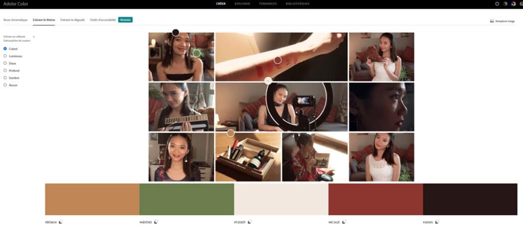
Tool 2: Adobe Color
This tool allows us to have more choices, by proposing palettes based on the color atmosphere (colored, bright, soft, deep…)
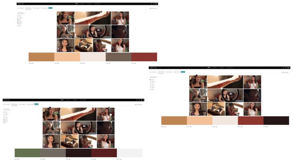
In Jeni’s case, I really like the palette based on the “colorful” atmosphere.
But Jeni has an obligation to some of the cosmetic brands she collaborates with: they need their products to be presented with green graphic elements, to underline their environmental commitment.
So we can change a color of the palette proposed by Adobe Color to green, by moving the cursor on a green area on the photo.
Step 3: Build the secondary palette
Tool: Html Css Color
Let’s copy the HEX code (the 6-character code, preceded by a #) of each of the colors in the main palette into the Html Css Color website to access lighter and darker colors of the same “family”.
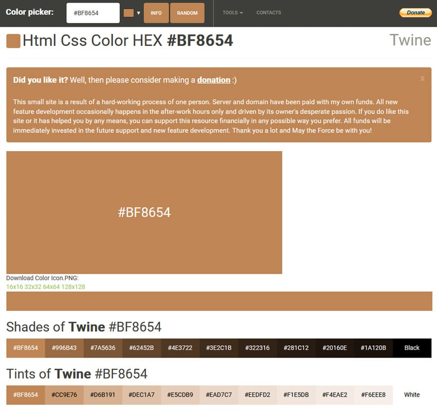
Let’s choose a lighter version of each color from the main palette to fill our secondary palette.
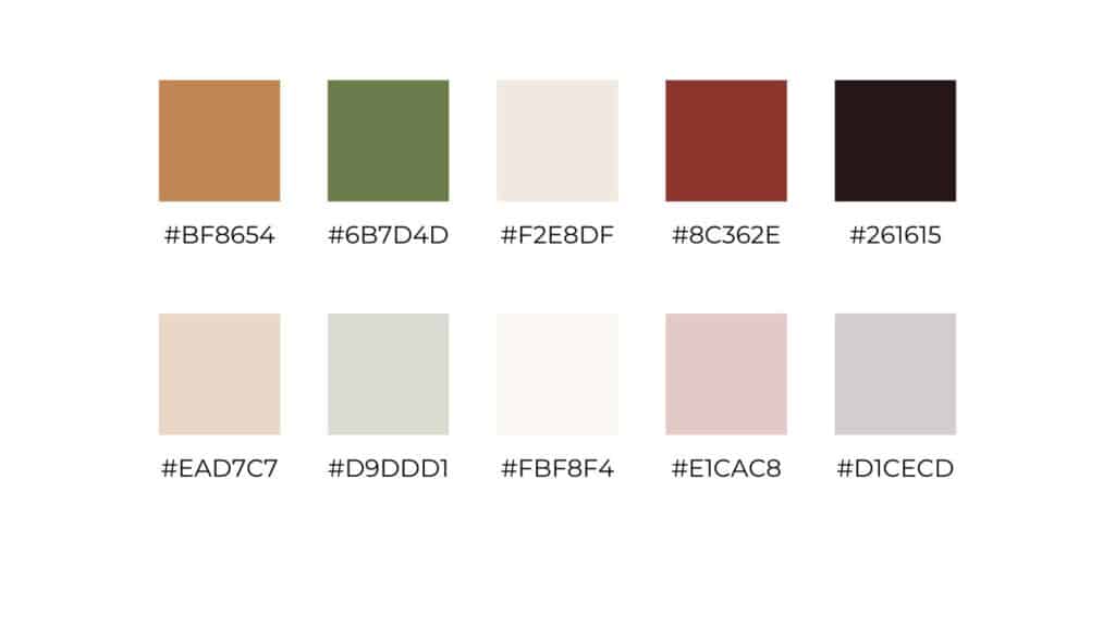
And here is our result:
What to do with these color palettes?
Only at this point can you look at color psychology to determine what color best reflects the spirit of your brand and content in your main palette.
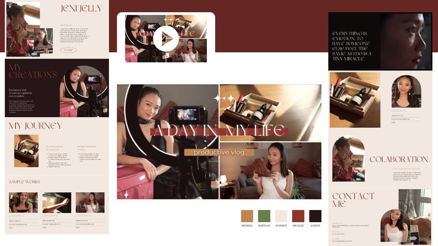
Here, I’m going to go with the color that is close to red, because red represents drive, passion, action, which fits Jeni’s personality well. Since Jeni has a very soft and feminine look, the color “red” in these elements also helps her accentuate the “willing, passionate, ready for action” side that doesn’t necessarily come out in her photos and raw videos.
This color will be the color of the titles in her videos, and titles on her website…
You can use other colors for other design elements, such as: buttons, banners, outlines…
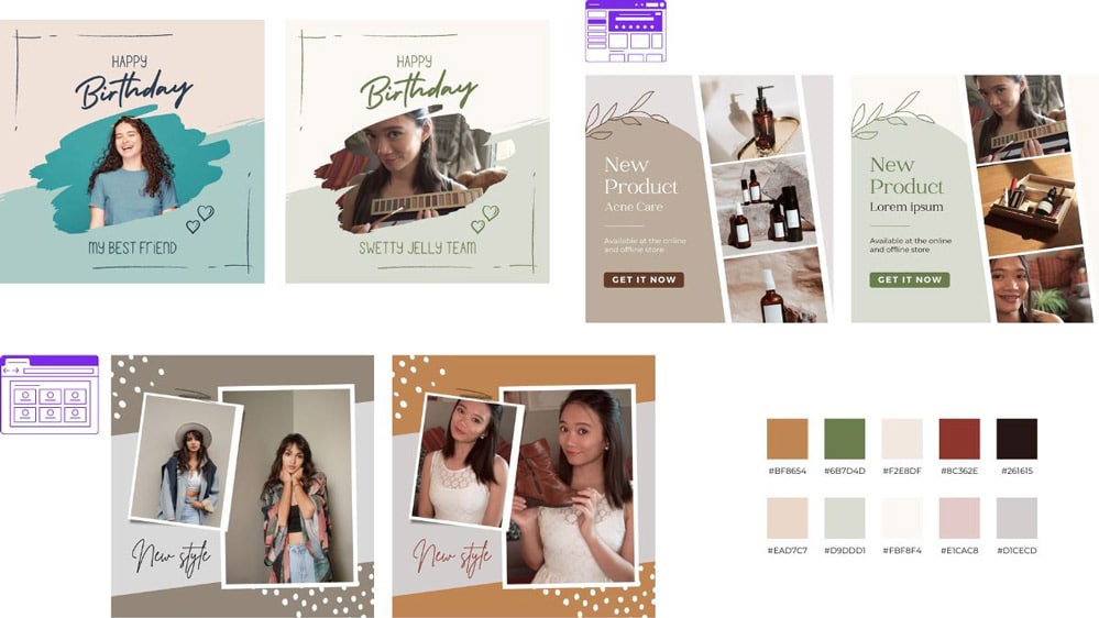
Let’s apply our palette to Jeni’s website and to the thumbnail of her new video:
If you use Canva’s templates to create your communication materials, here is a very simple trick to apply your color palette: Replace the light colors of the template by those of your secondary palette, and the dark colors by your main palette.
Another highly impactful solution for a unique and memorable visual identity
This wonderful solution is to integrate illustrations into your communication medium(s) (on your website, on Facebook or YouTube banners, or in your posts on Instagram or LinkedIn).
Illustrations offer a greater degree of freedom and creativity than photos or generic images. When an illustration is custom created, it can convey a story, values, and moods that reinforce your brand identity in a meaningful way.
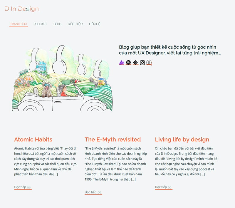
An illustration can also be created with your color palette in mind, like the example below from D in Design, with the illustration that tells the story of her journey to becoming an audiovisual content creator:
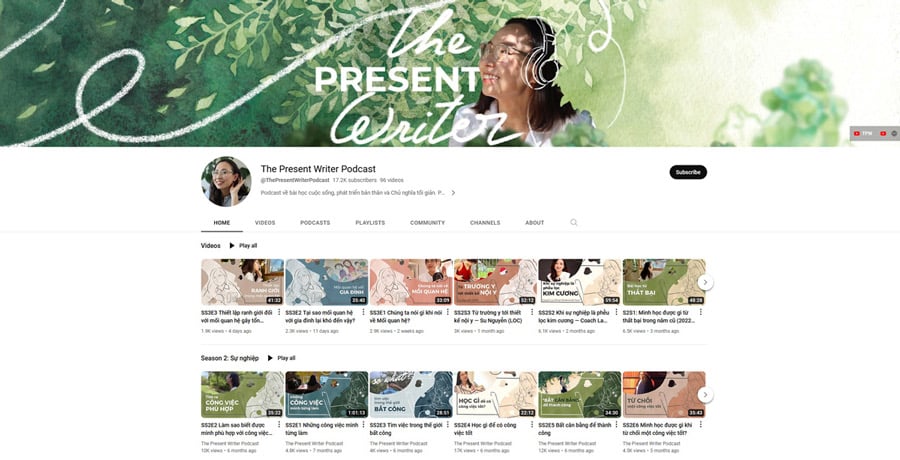
Or The Present Writer Podcast‘s YouTube channel banner, which recreates the atmosphere of a “silent green garden,” as the listeners have named the podcast.
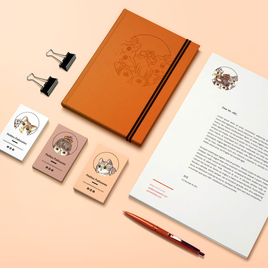
Or the logo of Petites Pattounes, which allows Rosagnigny, the deceased cat of the founder, to be eternally part of the sparkling adventure of her human mom.
I hope that the method presented in this article was useful to you.
If you have any questions, or if you would like to collaborate with me on an illustration project, please feel free to send me an email via my Contact page.
And I hope your personal brand will prosper and bring you happiness every day.
Keep creating!
Tu Ha An
*Please consult the information on Copyright & Intellectual Property before copying or mentioning the content and images of tuhaan.com
Related Posts
-

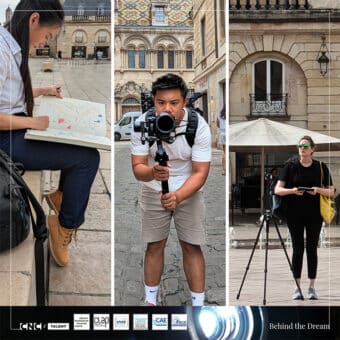
Behind the scenes of the Behind the Dream shooting, day by day
October 31, 2024 -
Rest & entrepreneurs
June 15, 2024 -
Should we accept or decline working for free? (as a creative freelance)
June 5, 2024 -
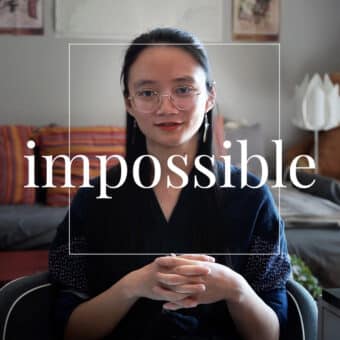
Let’s make the impossible possible
May 15, 2024 -
The mistakes that made me struggle on YouTube
May 5, 2024