Edited by my beloved friend K.L
I promise, this is a short article on client illustration.
Although I’ve shared some behind-the-scenes stories of client illustration before, you’ve probably noticed that these projects were either fictitious (article Illustration: from start to end (client project): when discipline is the base of magic) or the client also happens to be one of my best friends (article Behind the scenes of a real client illustration project).
From a professional point of view, this doesn’t change my creative approach. However, I can understand that it may seem biased to you, my readers.
Most of my blog posts detailing the behind-the-scenes of my creations, including the editorial project (Designer the cover for “A book about minimalism”, or a story about luck) are often over 3000 words long. Their video versions are about 7 ~ 20 minutes even if a lot were removed from the original blog posts.
For this reason, I want to try a more concise and direct format, focusing on the behind-the-scenes of a real professional client order.
This article is accompanied by a video (in French with English subtitles).
Who am I drawing for?
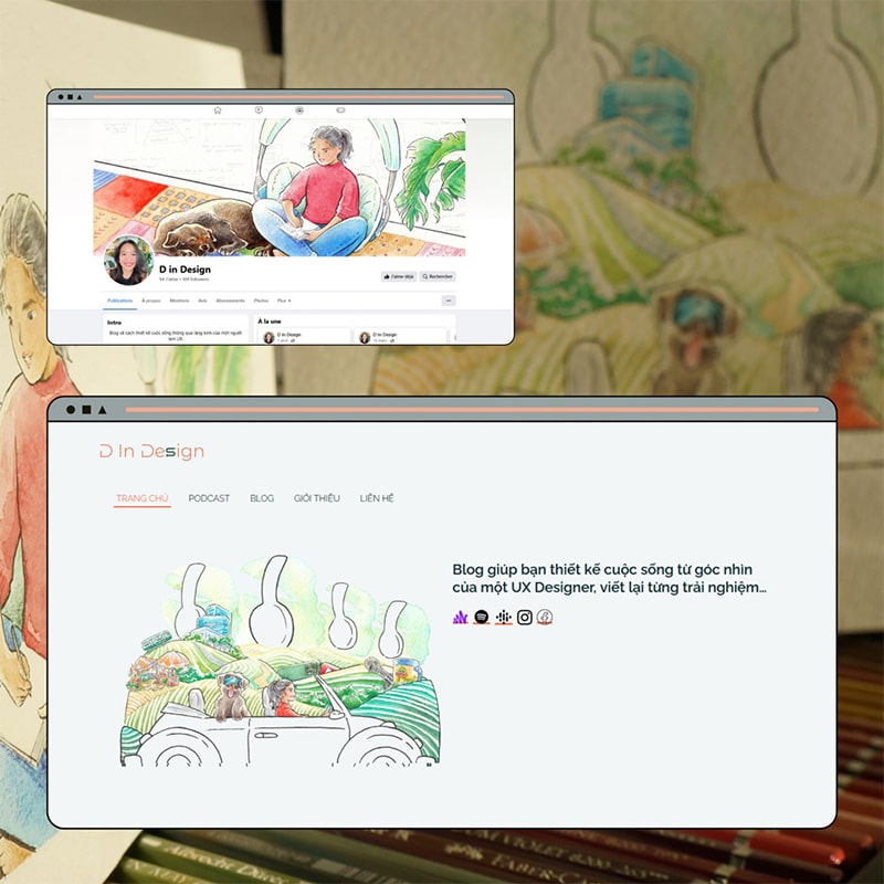
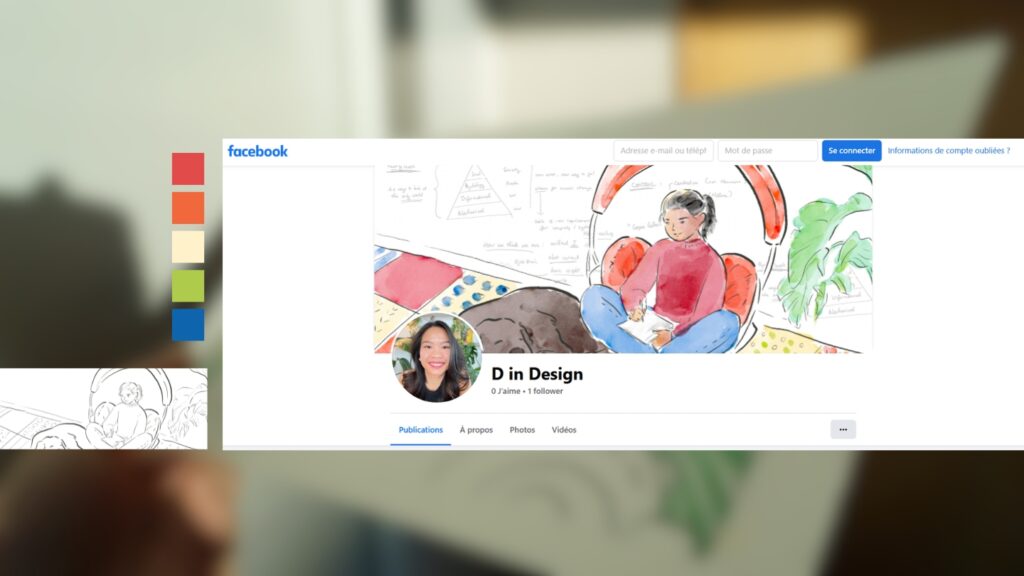
My client, Diệp Nguyễn, is a UX designer (a designer committed to improving the user experience) who just launched her brand in March 2023: D in Design, which focused on podcasting and spreading the knowledge of how to apply UX design into building a fulfilled life. Since her brand just arrived to the market, Diệp felt a need of some striking, high-impact, and as personalized as it could be to bring more visual support to her brand display.
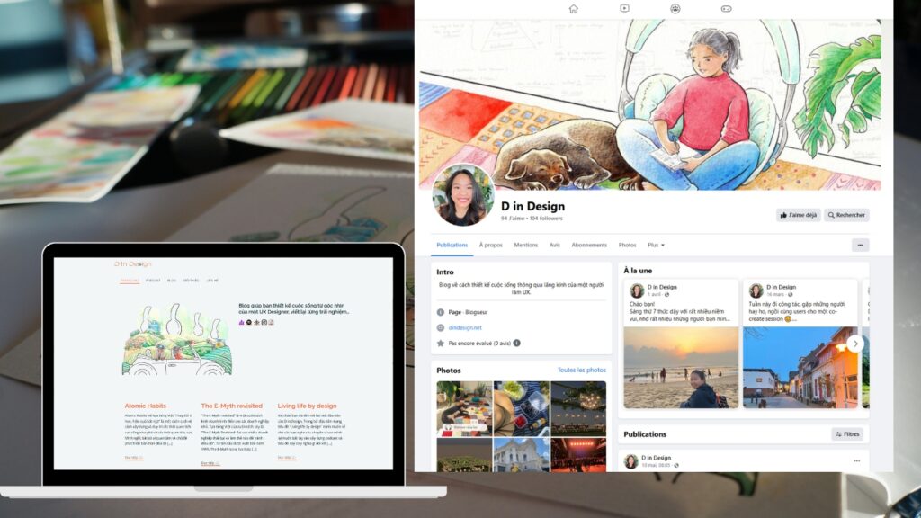
For this reason, Diệp came to me for a commission, which consisted of 2 illustrations: one for the banner of her Facebook page and another for her website.
What to draw in this client illustration project
The brief
“Every client project starts with a brief.” That’s what I have always been mentioning in my articles and videos. That is true, but it is also true that some briefs come with more details than the others.
In the following are Diệp’s requirements that made the first framework for our collaboration:
- Character to be drawn: Diệp and her dog, Tessa
- Details to be featured: Podcast and video, and several elements that represent Diệp’s stories as well as her vision for her D in Design brand
- Colors palette to be set upon: the orange and mint green of the D in design graphic charter
In Diệp’s case, the guidelines are precise, but there are no specific instructions dictating how each detail should be drawn, leaving me with still a wide field of possibilities for creativity.
The importance of talking to clients for an authentic illustration
Since I had no prior knowledge of Diệp’s background stories nor the creations that were produced by D in Design project, one step was essential: Brainstorming.
We first scheduled a two-hours meeting so that Diệp could confide in me why and how she build D in Design, and all ideas she had in mind.
Technically, this meeting isn’t obligatory, I could very well operate just by basing on the brief Diệp gave me. But I refuse to settle for simply creating a pretty but empty drawing. For me, it’s most essential that the illustration that I made truly resembles the person Diệp wants to communicate to the outside world, truly reflects the values that Diệp holds onto, her DNA, her personal stories with as much of strength and clarity as I could deliver. And most importantly, the illustrations must resonate with her audience.
Thanks to these discussions, I managed to identify the key elements to include and those to omit in the illustration as well as the main storyline.
And it was only after this brainstorming session that the ideas began to emerge. And by the same means, Diệp was able to persuade me to become a future listener of her podcast as well (😍).
A meeting the following week was arranged to move onto the next step:
The rough sketch & significant details in a customer illustration
The first sketch took shape quite naturally, mainly because Diệp already sent me all the references for the key elements that we agreed to put upfront.
No detail is left for random.
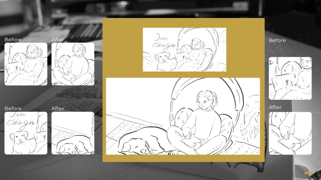
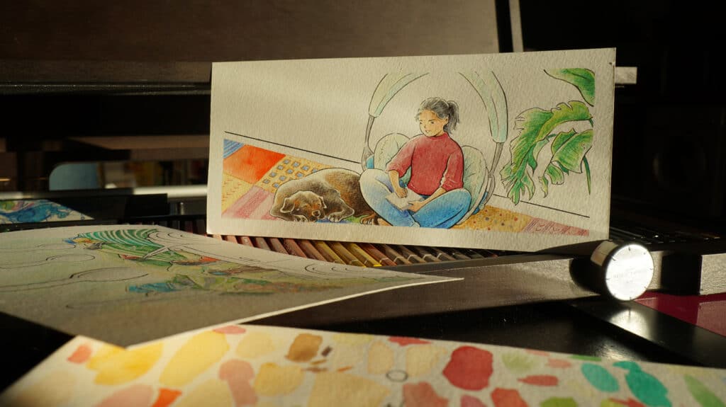
Illustration concept for the Facebook banner
On Facebook, the idea is to create something that can form an intimate and close connection with Diệp’s future followers.
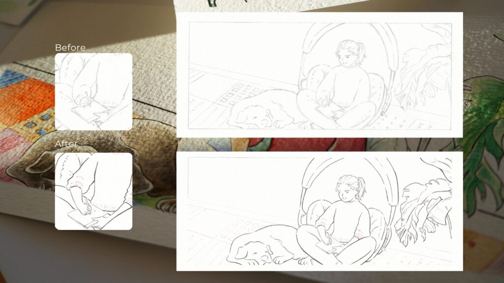
I chose to draw Diệp with her puppy, Tessa, as she works on her UX ideas on her devices because Diệp’s working flow is more digitally inclined than on traditional support like paper; and in her favorite corner, the cocooning area of her home, it’s a place dedicated to yoga.
For a touch of creativity and a feeling of escape, Diệp will be sitting in a huge headphone representing the heart of her brand: the podcast.
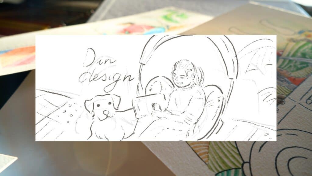
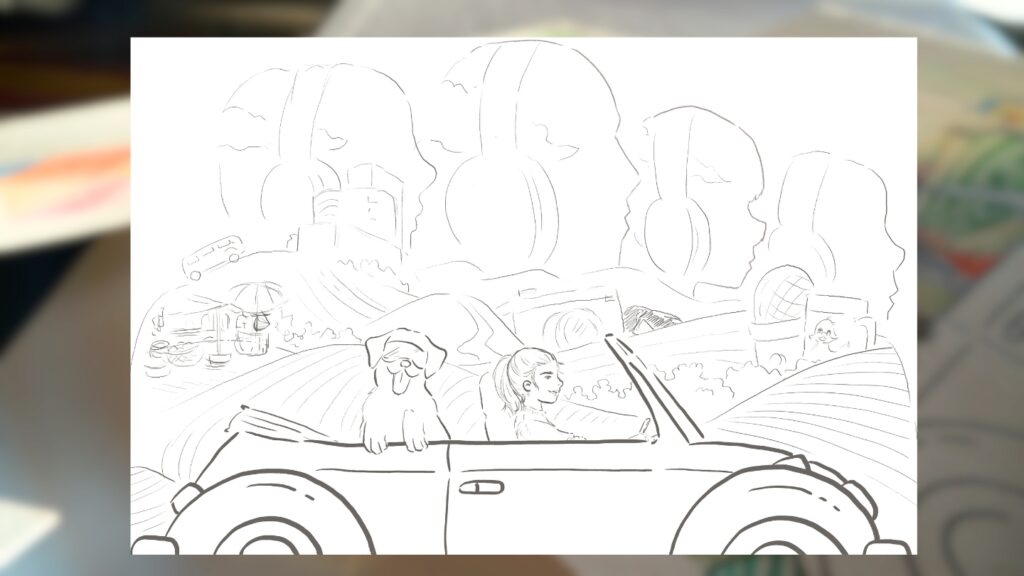
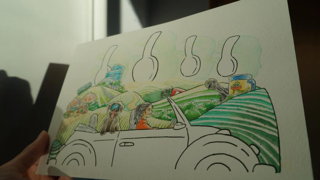
Illustration concept for the website
On Diệp’ website, our objective is for the illustration to be vibrant, meaningful and symbolic.
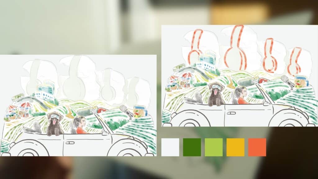
Diệp will be drawn driving with her faithful companion Tessa, the inspiration behind many of her creative ideas, through acres of vineyards that represent Germany, her adopted homeland.
Her car will be moving from left to right, symbolizing the transition from past to future in a visual language.
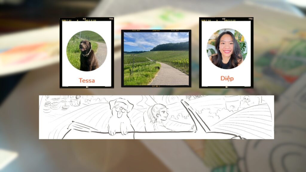
The elements scattered across the vineyard are pieces of her life.
On the far left is a Vietnamese market that represents the roots in Diệp and the influence of her childhood on her life.
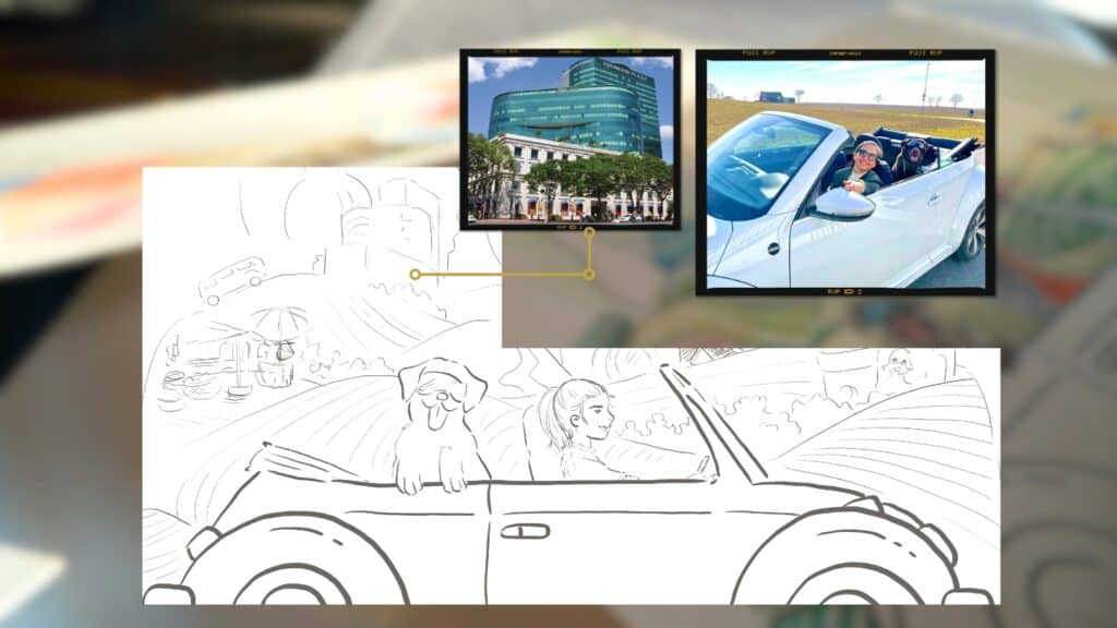
Further on, a bus leaves the village and drives towards Diamond Plaza, one of the symbols of Ho Chi Minh City in the 2000s. It is the memory of her university years and the contrast between her native village and the new world that was opening up to her.
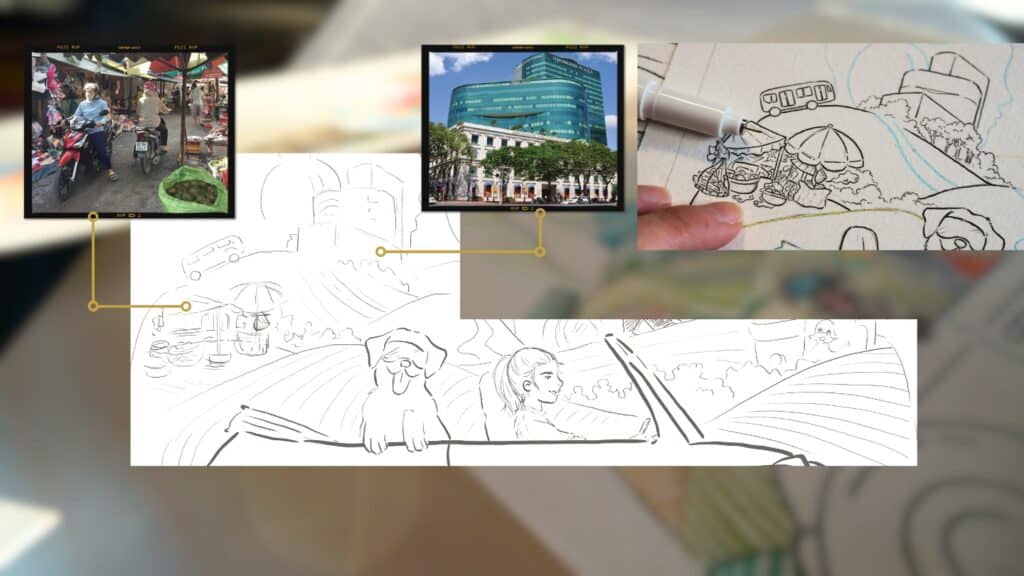
It was at Diamond Plaza that Diệp first saw a convertible Volkswagen that she dreamed of driving one day, an insane idea for the young student she was. Today, she proudly drives that same specific car, a milestone that lies immortalized in this illustration.
Diệp aspires to share her stories and experiences to help those who haven’t had the same opportunities as her, and who find themselves trapped by limited beliefs induced by barriers in education and culture.
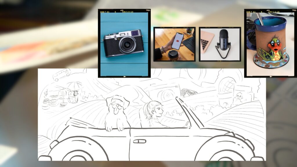
The YouTube play button, the camera and the microphone in the illustration represent her desire to spread these knowledge through videos and podcasts.
The microphone and the mug bring to mind the peaceful moment of recording and listening to podcasts, as well as her future plan of interviewing UX design experts over a cup of coffee.
The mug, adorned with an image of the ugly little duckling, is a nod to her childhood, her complexes and her fears, that by now are all fully embraced by the woman she is today. To top it all,the mug was also a gift from her partner, and it is for Diệp a symbol of love and understanding
The clouds in the background are made of figures wearing headphones. It is a discreet representation of the listeners that Diệp hope to reach with her contents, and who hopefully will accompany her wherever she goes.
The modifications
Upon receiving the sketches, Diệp immediately approved the direction that I first went for. However, there were still few adjustments to be made.
For the Facebook banner, Diệp wanted:
- Tessa to be drawn sleeping just like how she usually does
- to change Diệp’s position into cross-legged posture that she often does regardless of whether she is on the floor or sitting on a chair
- to substitute the phone and the laptop with a Remarkable tablet that she often uses to draw
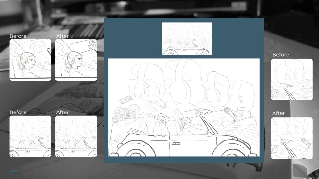
For the website, Diệp requested:
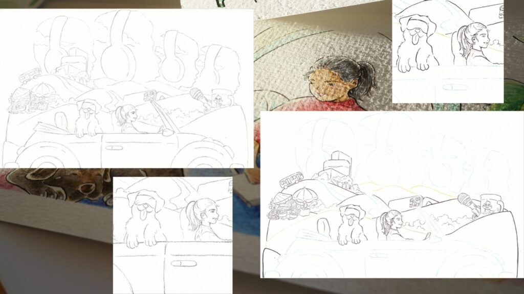
- her nose to be slightly revised to better reflect her real physiognomy
- the faces of the cloud-heads to be more representative of her target audience, with more “Vietnamese” features
- the featured microphone to be the one that she uses every day
- the camera to be substituted by her iPhone, which is actually her audio and video recording tools and also symbolizes UX design, the domain of expertise that she has long embraced
The color palette and clean sketches on paper
One week after the first round of review, we met again to discuss the results and what to do in the upcoming steps.
The job is relatively straightforward, as many of the elements are inspired by Diệp’s real life. And as a bonus, Diệp already had a color palette for her brand.
Color Palette suggestions
For the Facebook banner:
A brilliant move joined the process. Diệp provided me with her own sketches that were made on her real Remarkable for the background, highlighting the center of her brand: UX design.
For the website, we have two options for headphones for the figures that appear on the clouds.
Modifications
For the Facebook banner, Diệp chose the mint color for the headphones to bring an extra softness to a subdued atmosphere that could appear closer to the spectators, and to bring out the colors of her sweater and her carpet.
For the website, Diệp went for a black line for the headphones.
Clean sketches on paper and inking
I chose to draw Diệp’s rolled-up sleeves in the sketch, as it seems to be quite a habit she has even in cold weather. It’s a character trait that may seem insignificant, but I felt it was important to emphasize so that the illustration would resemble her as closely as possible.
Coloring: when customer illustrations come to life
I made a point to pursue my illustration career from a traditional approach, with paper and ink. And thus, by the time the coloring step is reached, no changes can be made once the line was drawn. But I think Diệp, like me, had no worries, just palpable excitement at the idea of discovering the finished illustrations.
After two weeks, we met up one last time, so that she could see the grand finale of our collaboration!
Client illustration, or a shared creative adventure
It was with a touch of nostalgia that we brought our weekly meetings to an end. These few weeks of collaboration with Diệp have been a true creative adventure, a deep dive into her universe and the twists and turns of her creativity. The original illustrations, filled with her own story and vision, were sent to her home, while their digital scans are now taking their place on her page, ready to accompany Diệp every day as she nourishes even more ideas.
I am grateful for the opportunity to contribute to this unique and inspiring project. And although the weekly meetings between me and Diệp came to an end, I know our paths will cross again in the future. In the meantime, I look forward to seeing how these illustrations will be a part of the world of D in Design and an inspiration for those who have the privilege of discovering them.
Keep creating!
Tu Ha An
*Please consult the information on Copyright & Intellectual Property before copying or mentioning the content and images of tuhaan.com
Related Posts
-

Book review : The Art of Kelogsloops – From Sketch to Finish
May 15, 2025 -
Behind the scenes of the Behind the Dream shooting, day by day
October 31, 2024 -
The mistakes that made me struggle on YouTube
May 5, 2024 -
1 retrospective and 5 reasons that will save 5 years of your creative life
April 5, 2024 -
Am I afraid of making mistakes when blogging in three languages?
March 15, 2024