Edited by my beloved friend K.L
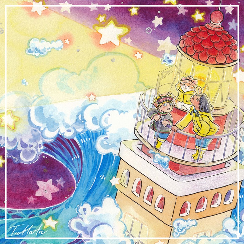
April 2021, I was in the middle of starting a career in illustration. I wanted to have a website with a strong impact from the moment visitors landed on it. I needed a banner with an illustration that make people goes “wow” at first glance.
Days and nights, I was looking for an illustration idea that could represent my style, my universe and my person.
One day, a postcard in a supermarket planted the ultimate idea in my head…
An unconvincing illustration idea
I immediately called a close friend to tell him my idea: “Bro, I’m going to draw a lighthouse in the storm and make it the banner of my future website!”
My friend sounded much less enthusiastic than I did. After a few seconds of silence, he said, “You want to attract people to your website, right? I’m afraid that a lighthouse in a storm is too sad and aggressive for your future visitors…”
At that moment, I realized the curse that fall up the creatives. They cannot show others what they see in their heads. The best way for them to explain their imagination is to turn the idea into some sorts of reality.
But then, building a scene that looks good with elements that are more conventionally considered as “pretty”, “peaceful”, or “positive” is not challenging. I want to build joy and calm with an element as “dangerous”, “sad” and “dull” as it could be.
So, I just went straight to build up my lighthouse in the storm.
My person, my roots
The reason for me being so drawn to the image of the lighthouse in the storm comes from a memory. I left Vietnam, my home country, to attend university in France when I was 17. Since I was still unable to have close friends during my first year, I spent the first two school holidays studying in my dorm room. Being concerned that I would drown in loneliness, a professor at the Institute invited to me to spend the winter holiday on the Isle of Sein with his family.
That very week, I saw a lighthouse for the first time, I saw a storm at sea for the first time, and and also for the first time, I felt like I was able to blend in French people’s daily life instead of being a mere outsider.
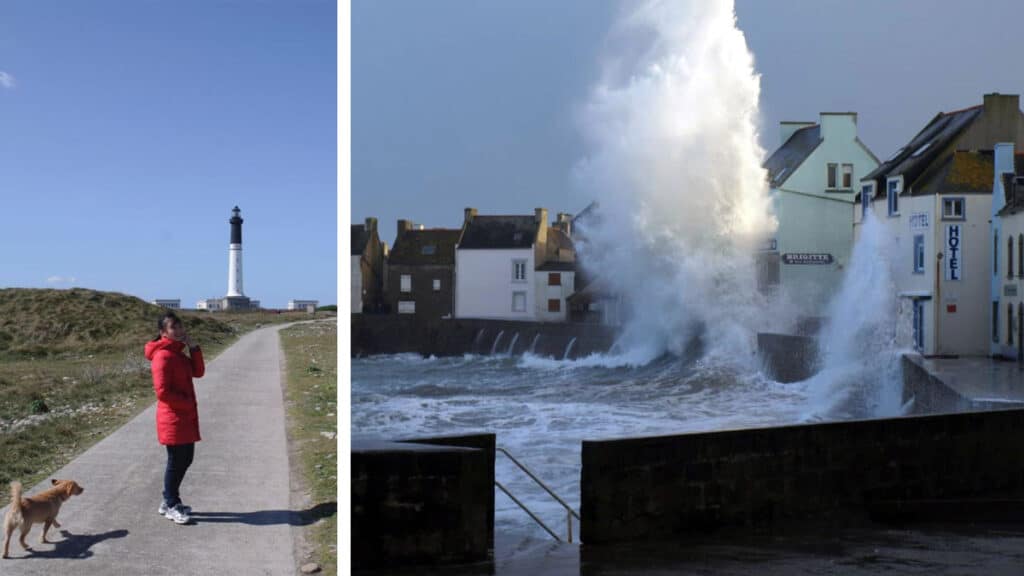
Since that day, Bretagne became my adoptive land. I grew eager to see my two roots, Vietnam and France, to be symbolized in my illustration.
My universe of multicultural illustration
I always dream of a world where cultures are exchanged and mixed (like San Fransokyo from Big Hero 6).
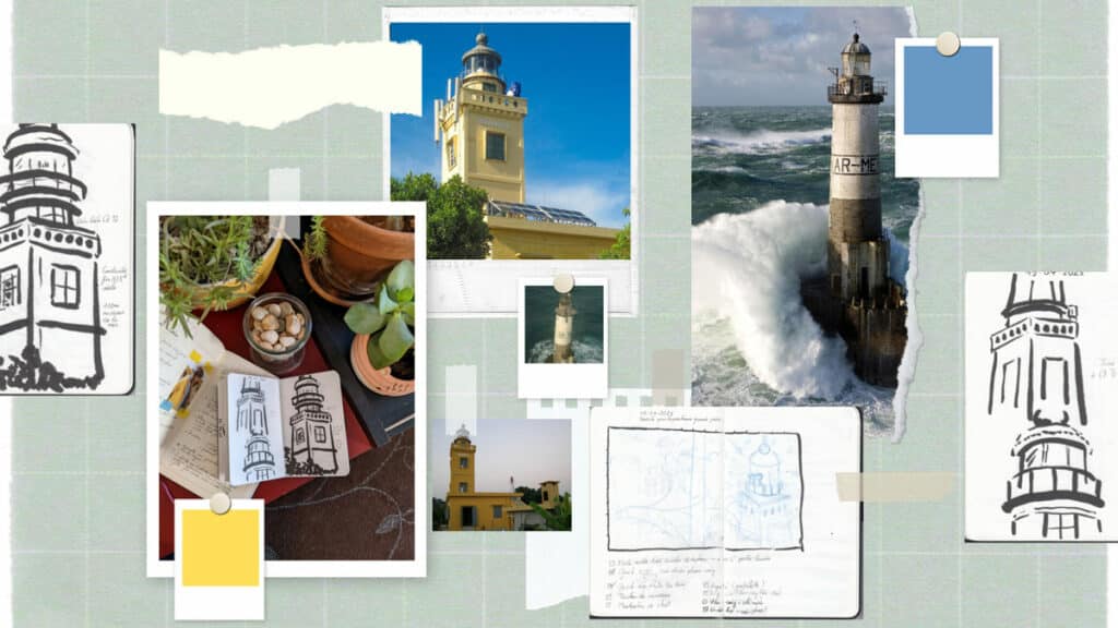
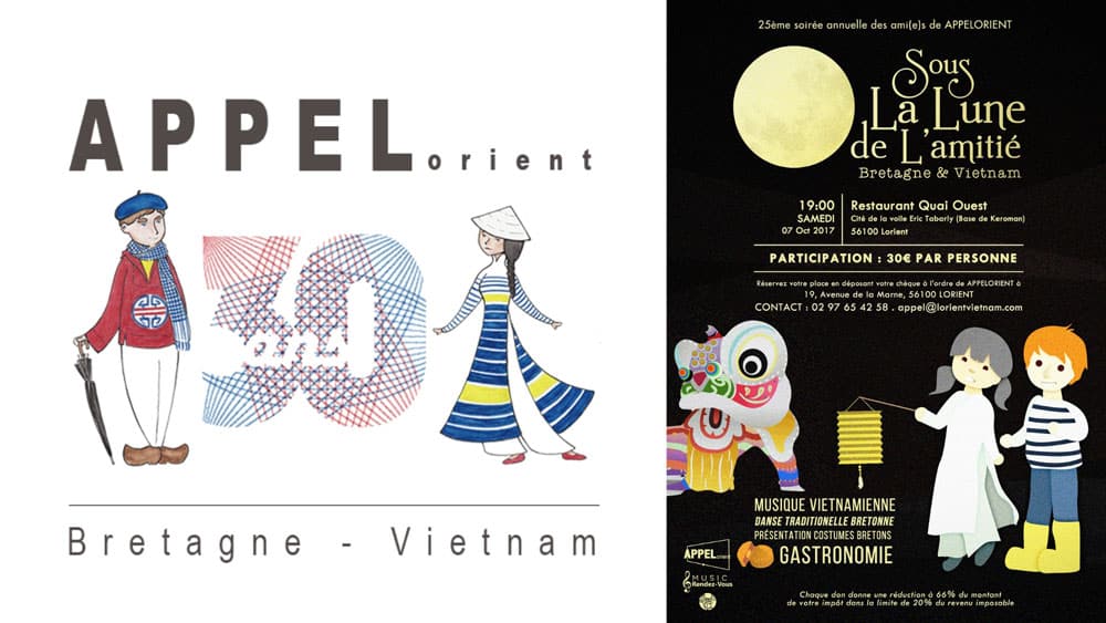
So I conceptualized a lighthouse with the architect mixed between the lighthouse of Ar-men (France) and the lighthouse Cô Tô (Vietnam). Ar-men is a lighthouse visible from the Isle of Sein, while Cô Tô is the highest lighthouse in Vietnam.
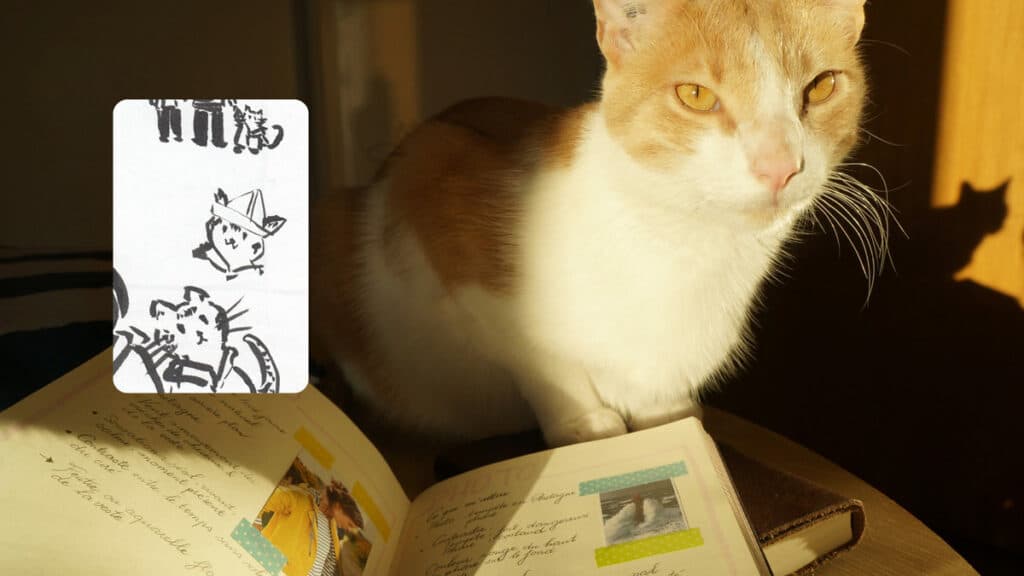
In my world, the presence of animals is essential! So I drew my cat, Romarin, not only because he is my faithful assistant, but because there might be no cat in this world that could seem more “multicultural” than him. While he is officially identified as a “European cat” by my veterinarian, my parents and friends in Vietnam all asked me how I managed to find a Vietnamese cat in a Western country…
From my love for drawing characters, I had the idea to add a little French boy and a little Vietnamese girl in the illustration. The little boy’s outfit is the traditional outfit of the Dao ethnic group (Vietnam). The little girl and the cat are wearing the famous Breton yellow raincoat (France).
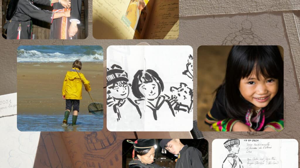
At first, I had in mind the image of two children of the same age. But one of the feedbacks from my friends was: “It looks like you and your (French) boyfriend!” Even though that comment was made without any ill intention, it still made me think a lot.
It is true that in the posters of cultural exchange events, we often see illustrations of a confident little Western boy with a reserved little Asian girl. It is also true that the image of the mixed couple “Western man – Asian woman” is very common… Unconsciously, I might have represented the same pattern in my sketches.
On this personal project, I have no constraints. So I thought to myself that why not tell a different story, with a confident and dynamic little Asian girl who introduces the magical storm scene to a reserved little Western boy?
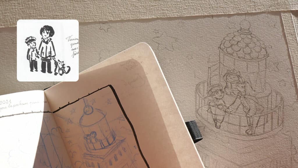
My dreamlike illustration style
When the research for the project is done, I moved on to sketching and coloring, which is also always the most satisfying and stressful stage.
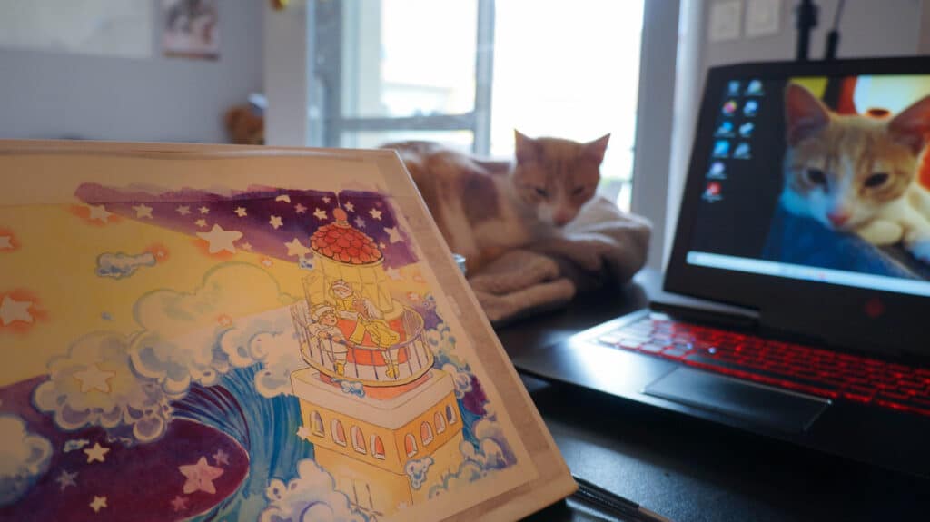
The moment I sent this photo of colorization in progress to the same friend who was weary of my idea about lighthouse in a storm, he didn’t seem very happy (but I guess in a good way). He said, “Sis, I don’t like it when I’m proven wrong! Honestly, I wish I lived in your head!”
The magic of an illustration
The illustration is finished after 17 hours of work.
December 2021, it officially became the banner of my website, the very first image that immerses visitors in my universe when they arrive on the site.
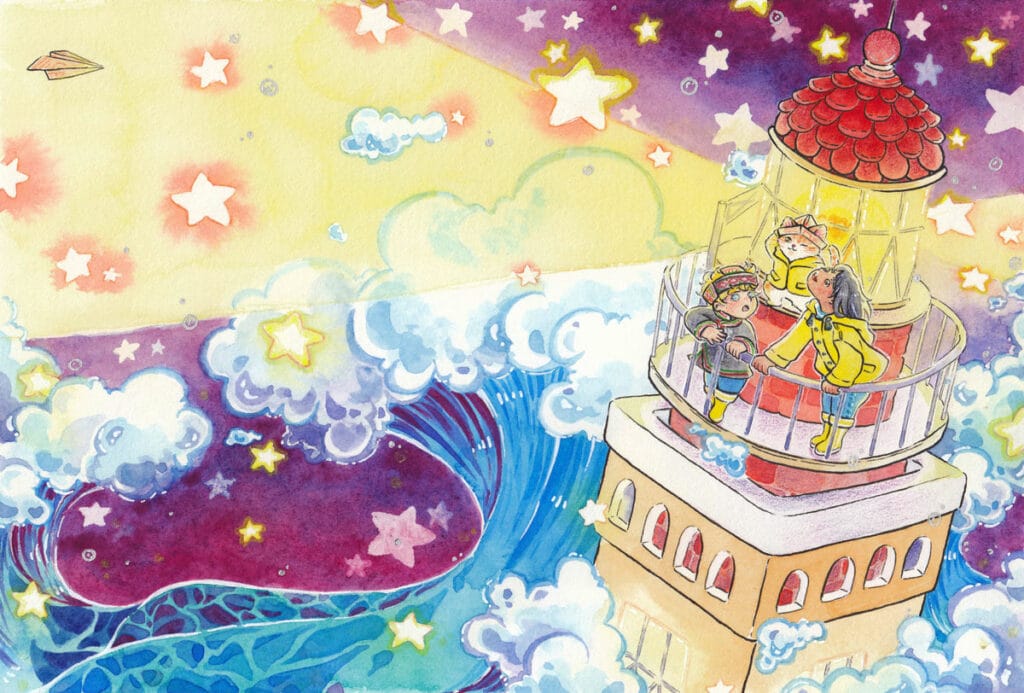
But there is a magical secret about this illustration that the site visitors haven’t known yet: The stars in this drawing can light up for real!
Here some proofs:
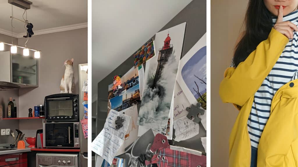
Do you want to know another secret? As I write these lines, the postcard that inspired me in the supermarket found its very honoured final destination on my fridge door, close to Romarin’s post when he is on his guard duty, and not far from my (actual) yellow raincoat.
If you are curious about my detailed illustration process, here are 2 very complete articles that trace my process from A to Z:
Keep creating!
Tu Ha An
*Please consult the information on Copyright & Intellectual Property before copying or mentioning the content and images of tuhaan.com


